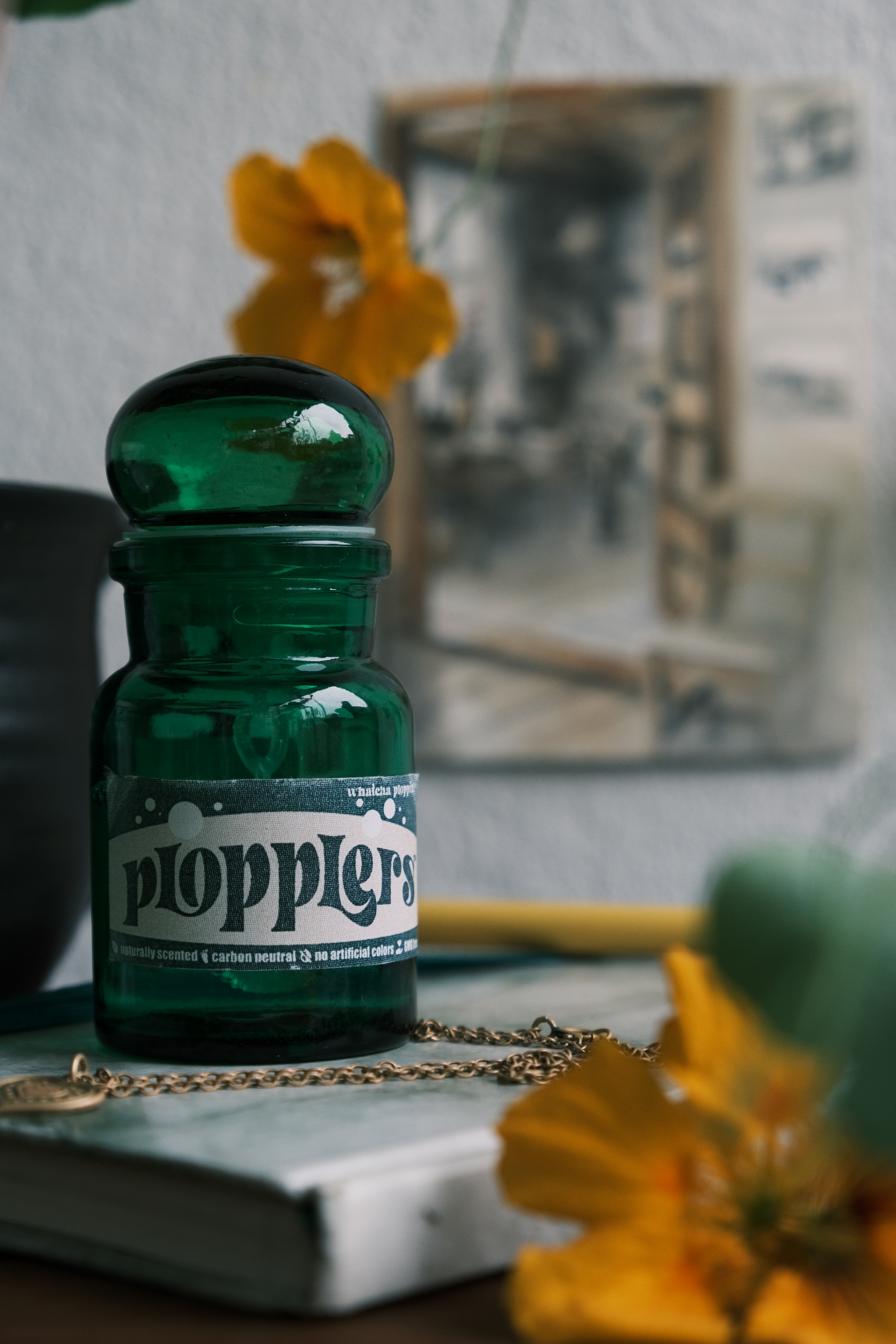
Iridescent
2022 / Speculative design and movie prop making:
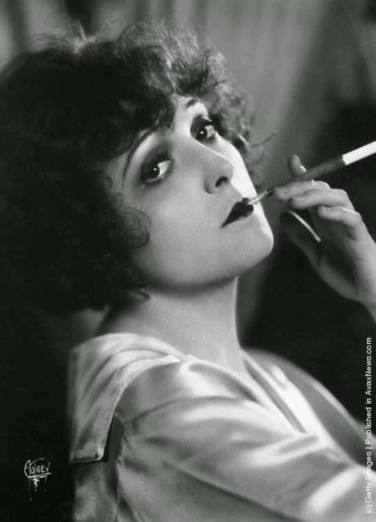
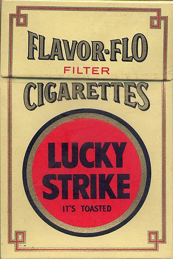
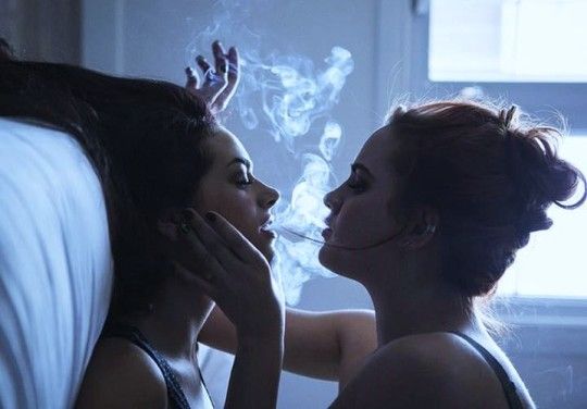
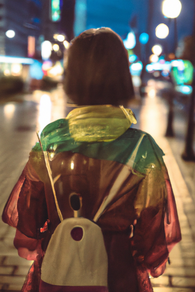
“What if we replaced cigarettes with soap bubbles?”

Iridescent is a speculative product design series that originated as a concept and prop in a friend’s film project.
What if we reinterpreted the concept of blowing soap bubbles with the lifestyle branding and subjective “coolness” factor of smoking cigarettes. What would it look like? Would it be possible to forestall new smokers with the right product design and marketing strategy?
Role:
Ideation, visual concepts, product design.
Context:
Indie film prop creation for Mantelpiece Productions and personal project.


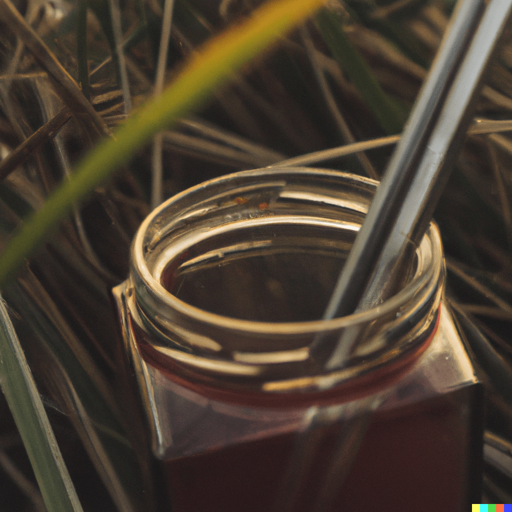
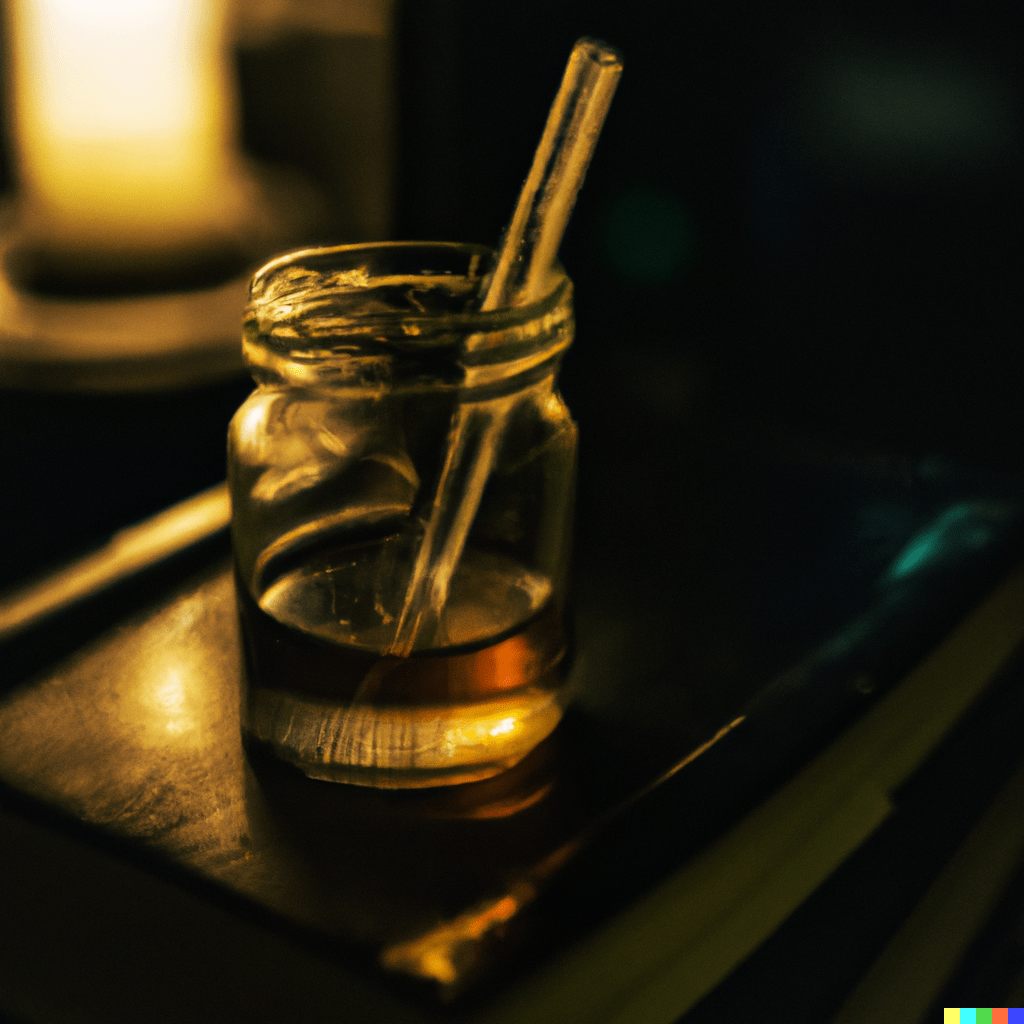
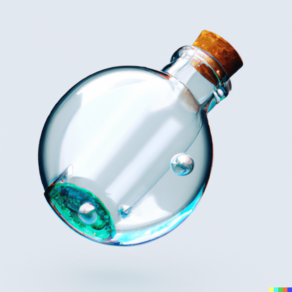
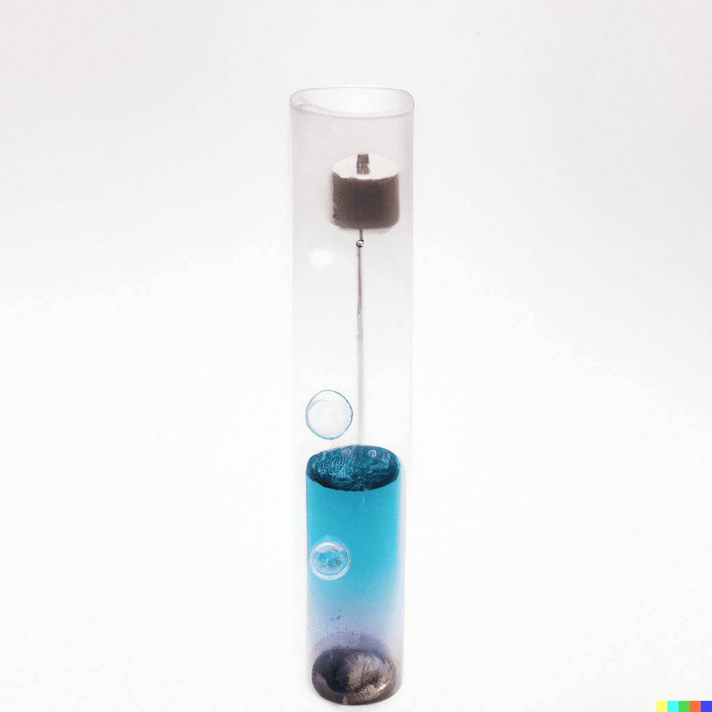
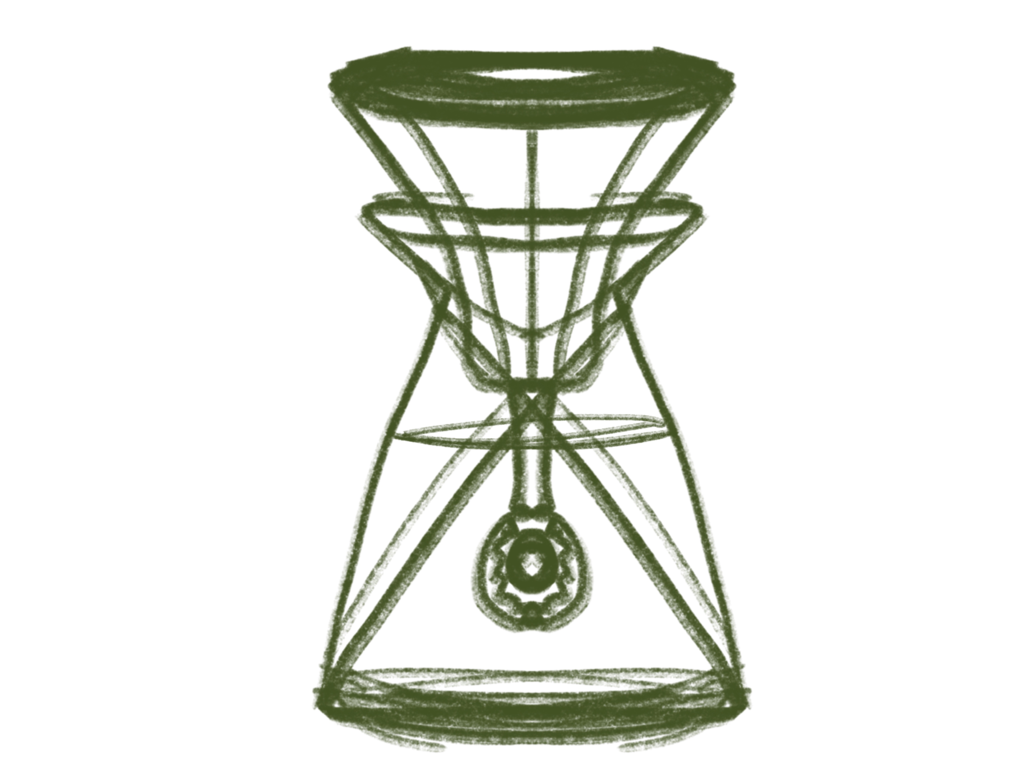
Sketching

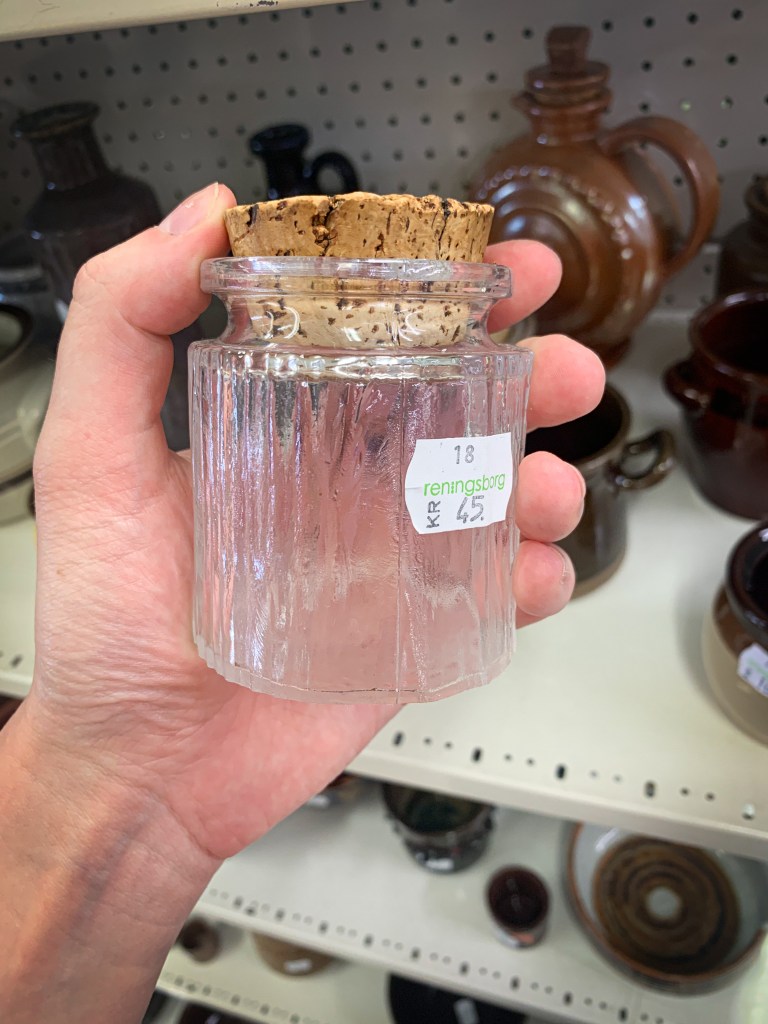
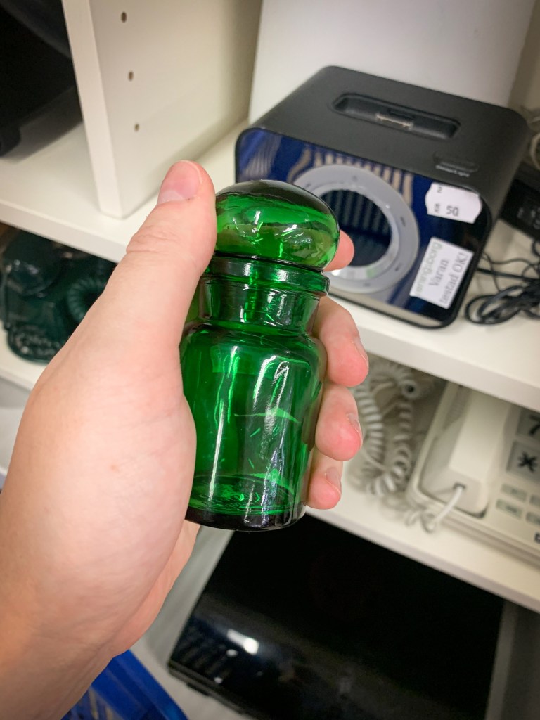
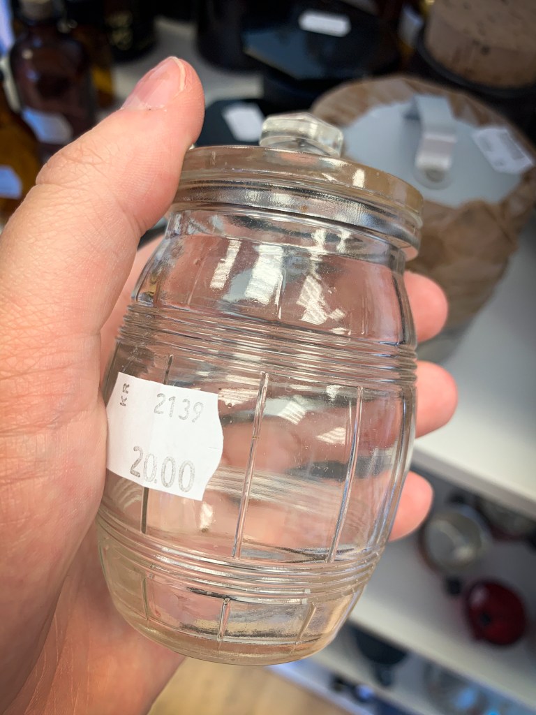
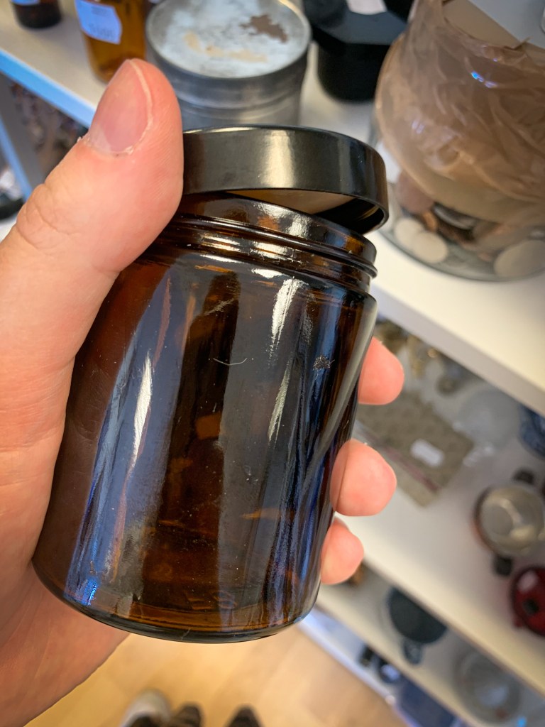
Bottle shopping
Low budget filmmaking offers little opportunity for custom made products and, in this case, bottles designed with special proportions. It does however allow for many long second hand runs, trying to find the perfect hand-sized glass bottle with a wide enough brim to fit a soap bubble stick.


Character exploration
Three alternative directions and personas were created to clarify the personality of the character and determine the direction of the continued design.
Amanda. A creative, free spirited woman who cares about the environment more than brands and appearances. She has a strong sense of identity, strict morals, creates her own produce and makes do with reusing materials that are already in her possession. She claims her own brew is better than anything store bought, but is just using the most popular online recipe.


Beatrice. A put-toghether modern woman who enjoys posting pictures of her home to social media. The most important thing when choosing a bubble brand is that the bottle works with her interior design style. She will place it on her coffee table and rarely use it.


Cassie. A creative, bubbly woman who presents herself as very laid back and quirky. She wants accessories with lots of color and has a slightly childish aesthetic. She will pretend that she bought the cheapest bottle but probably fell for a commerical.

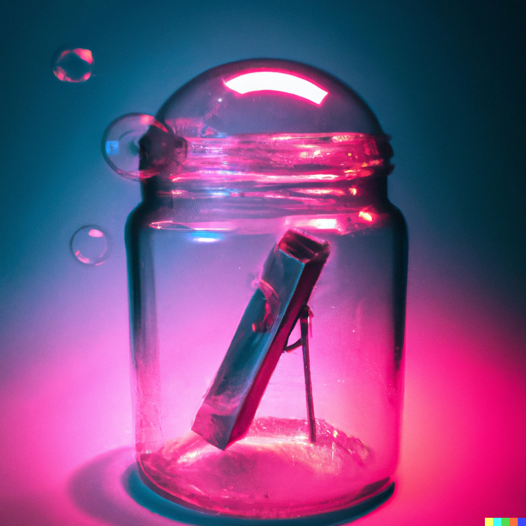
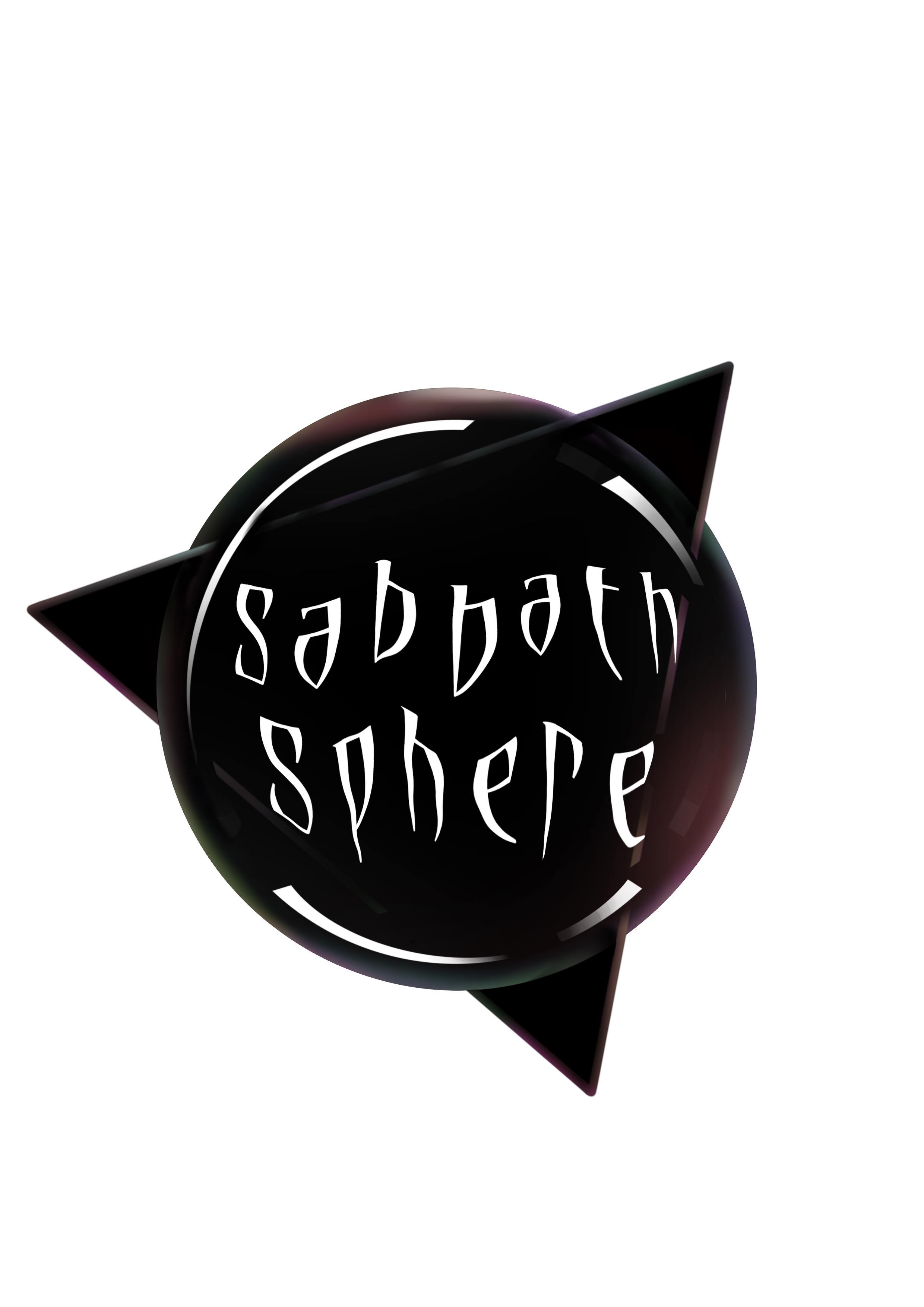
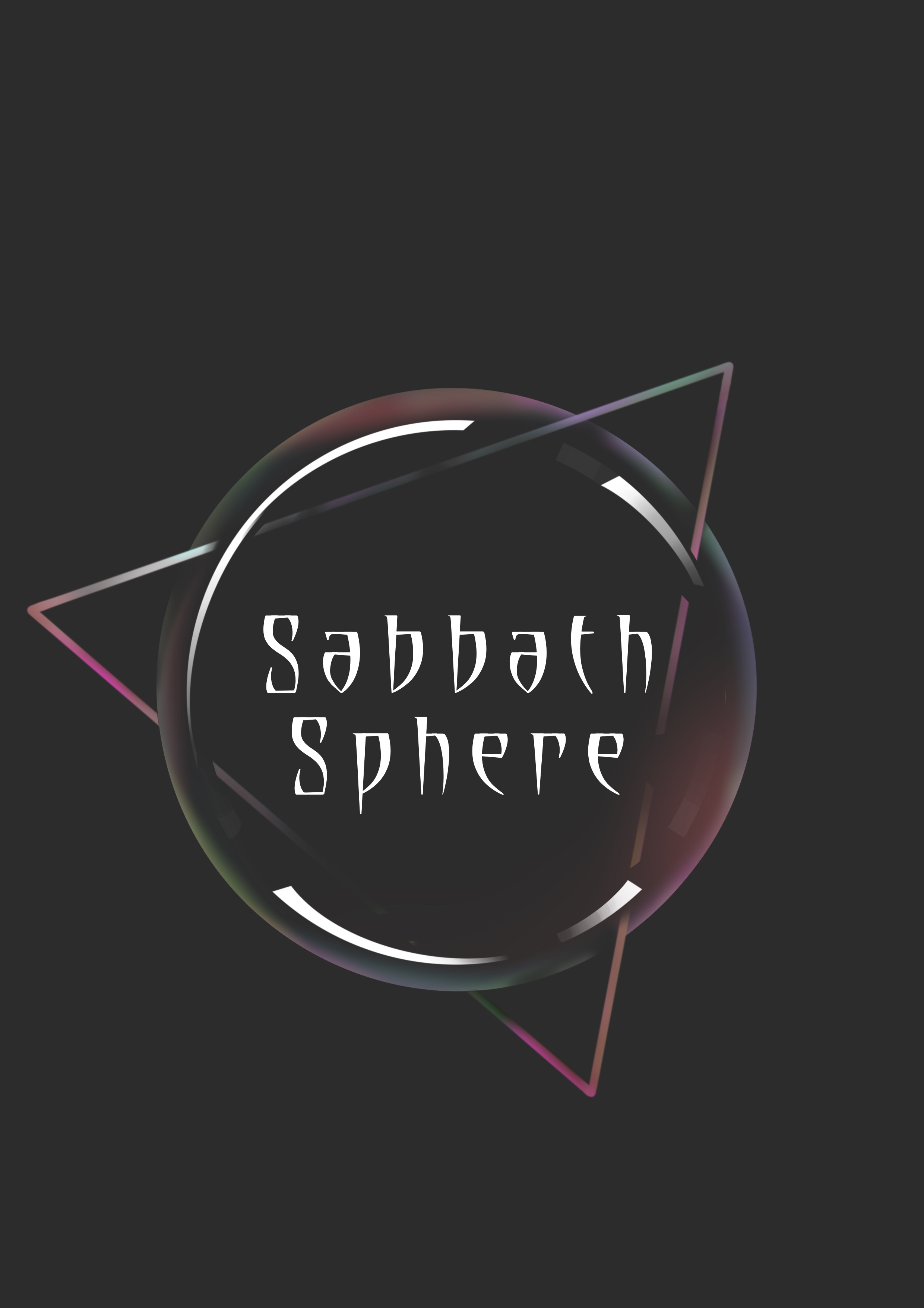
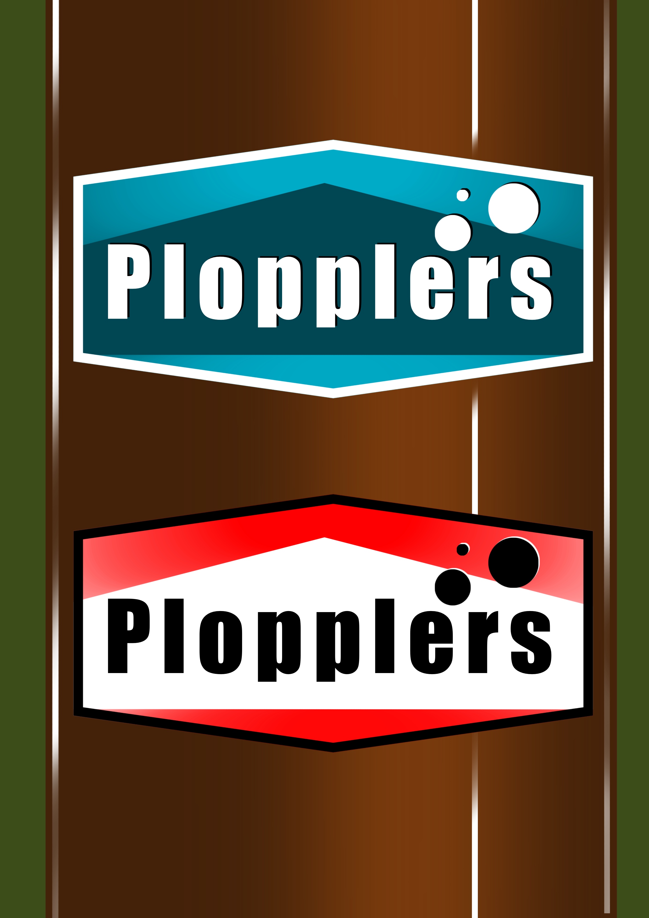
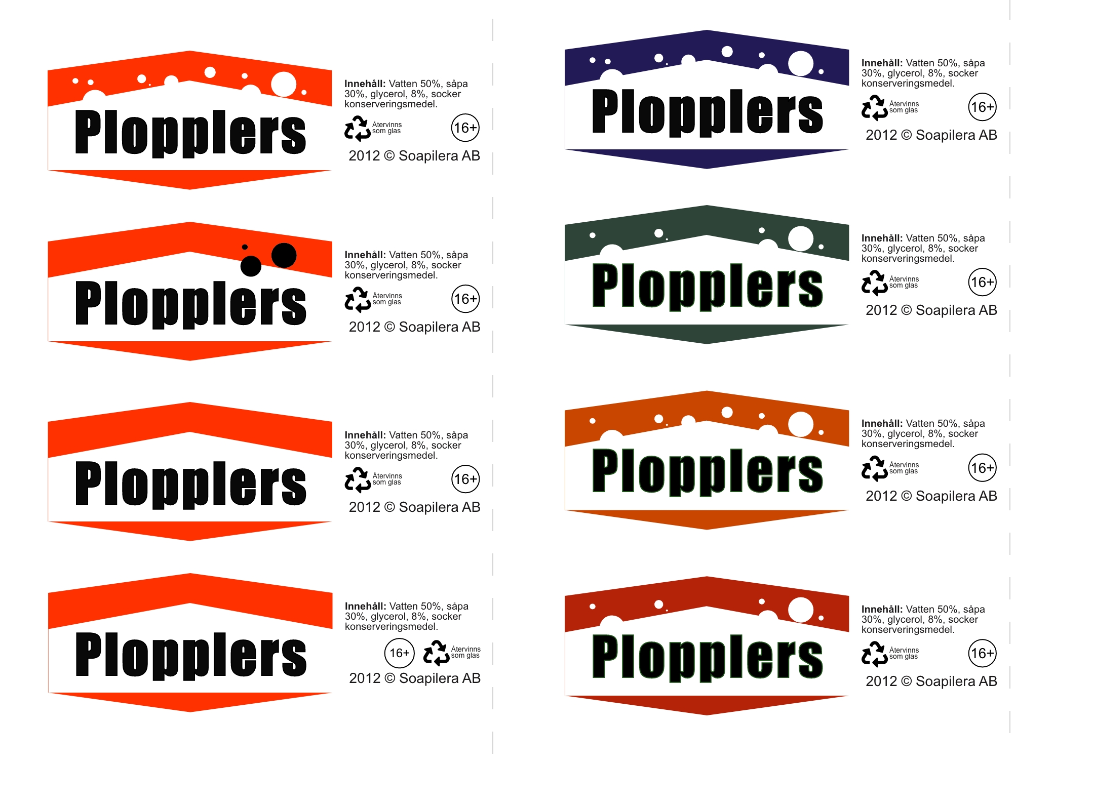
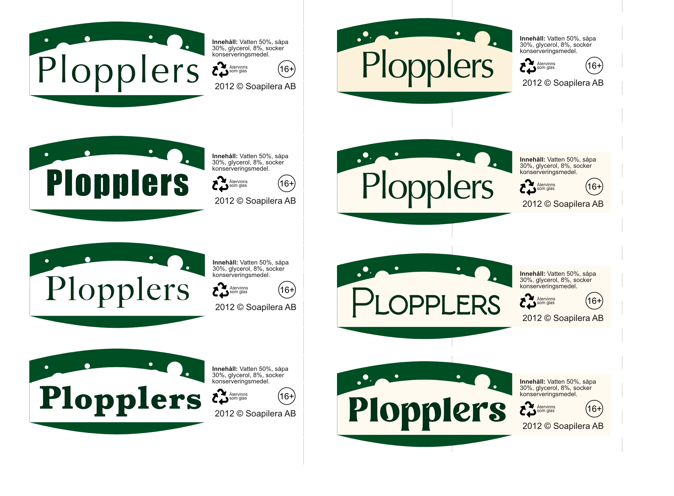
Label iterations
General shape and direction decided based off sketches and reference images. The first iterations focused on further defining the shape, font and color scale.


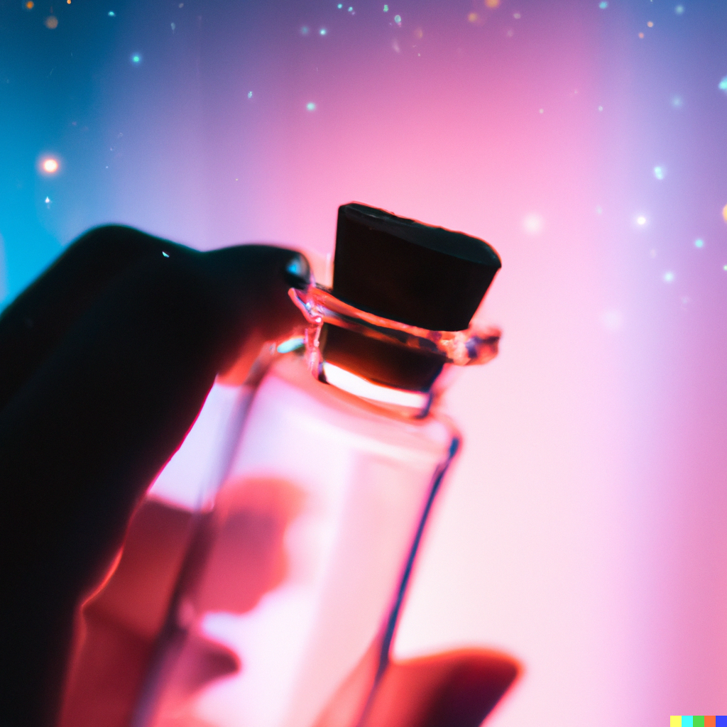
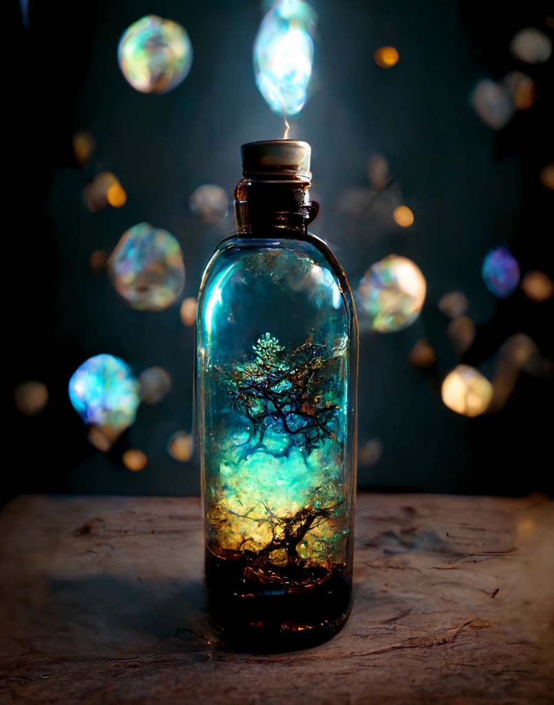
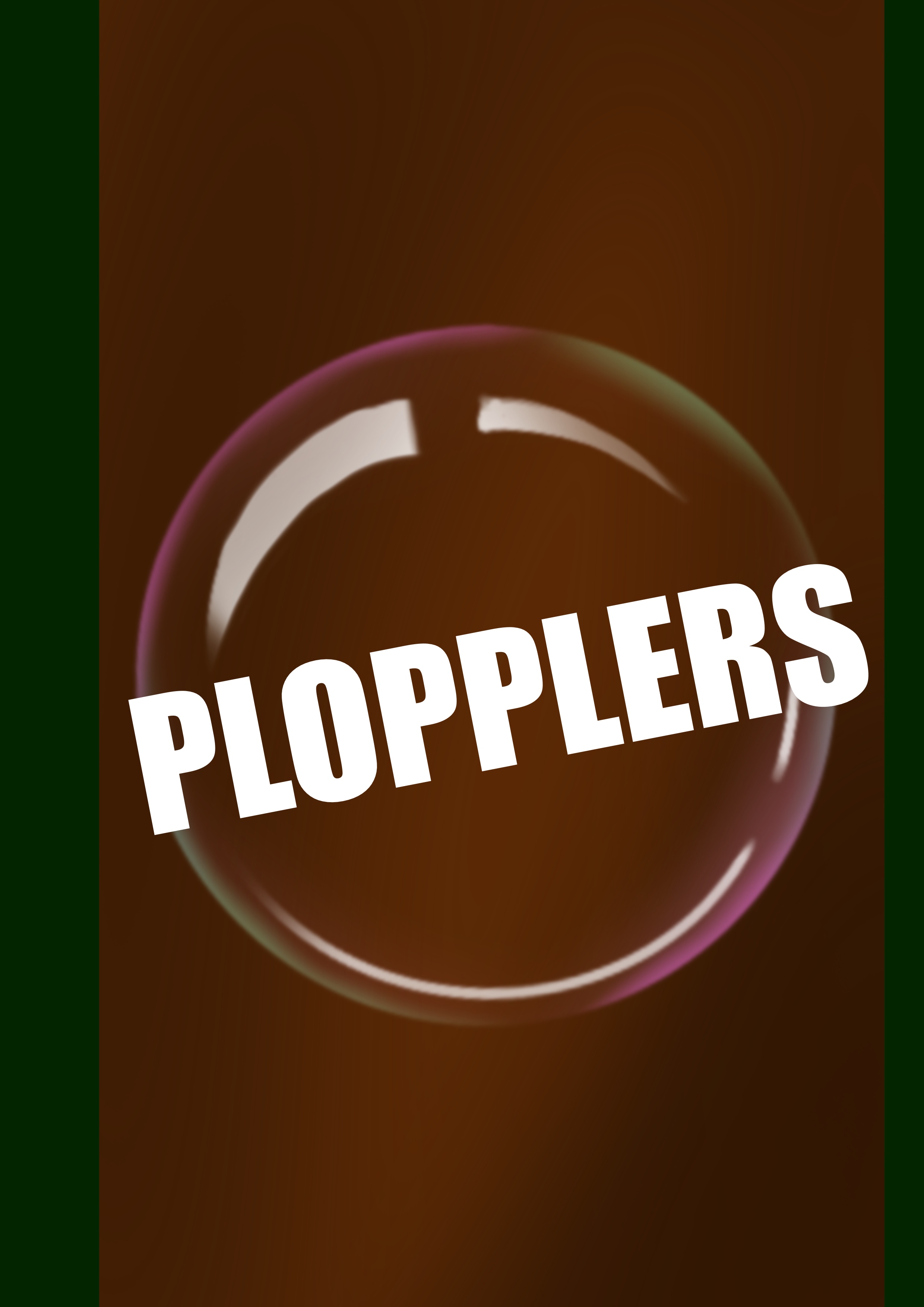
Final prop design